Acklebury
Reverse Contrast Serif
Published in 2020
Jonny Gibson
2 styles
v1.01
38 languages
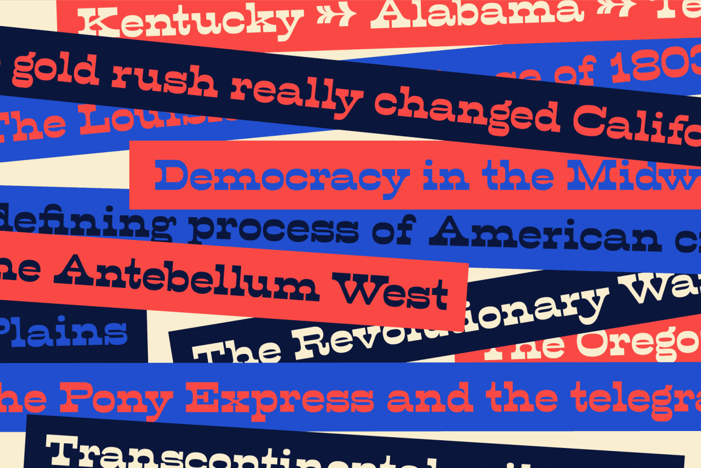
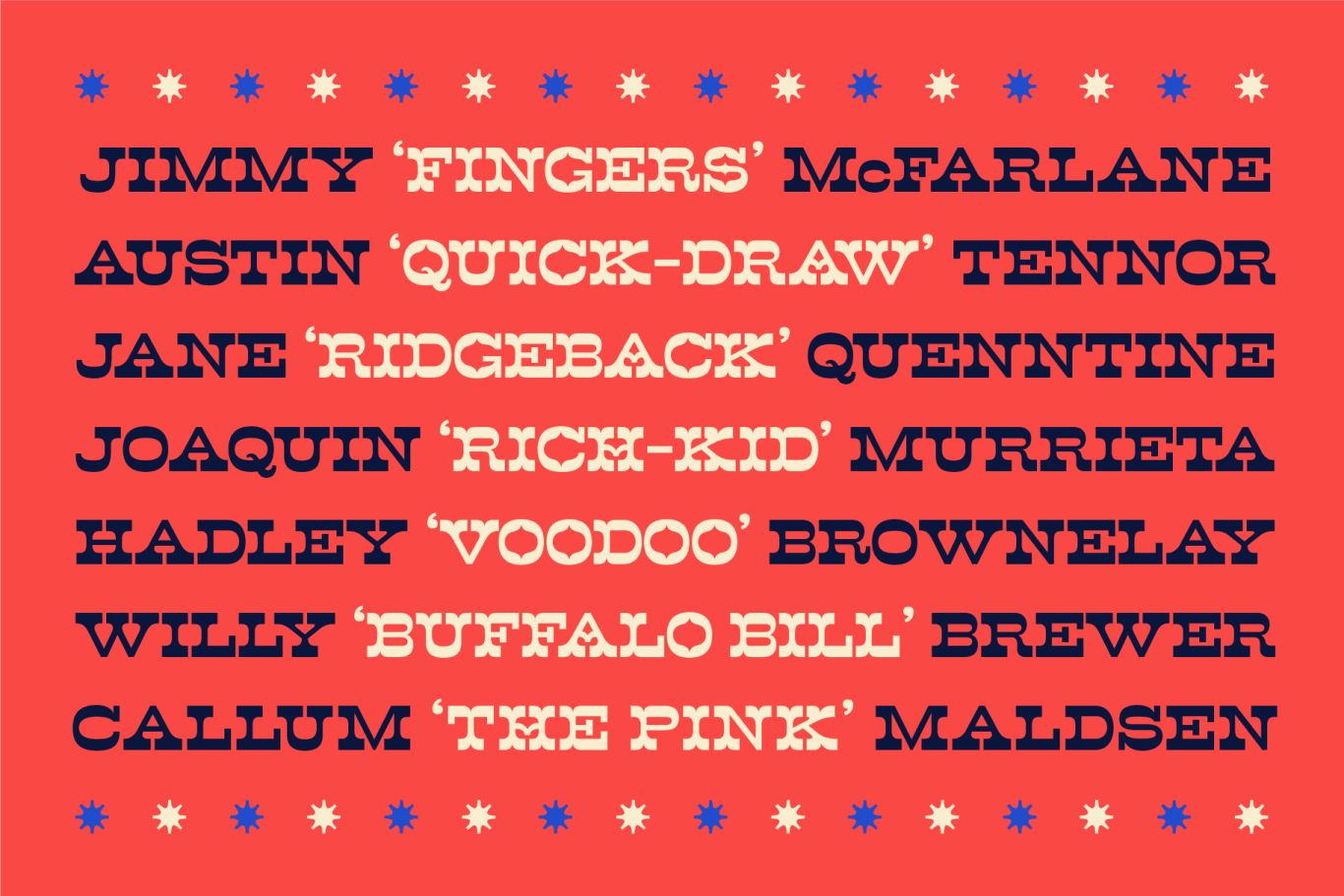
Acklebury is a chunky, reverse contrast, slab-serif typeface available in two styles. It has heaps of personality, plenty of open type features, and a whole host of special characters and dingbats.
Although it's drawn from historical sources, Acklebury is not a straight revival, rather more of an homage to the many, varied, extended lining figures of the late 1800's. Acklebury celebrates the once labelled 'hideous' combination of wide rounded forms and hard slab serifs. Only using modern type technology to fix the spacing and kerning issues that would of been impossible with metal or wooden type.
Acklebury is not a French Clarendon, neither is it really an Italienne... but it is phat, wide and hella funky.