Compita
Neo-Grotesk Sans-Serif
2020
Jonny Gibson
6 weights + Italics
v1.0
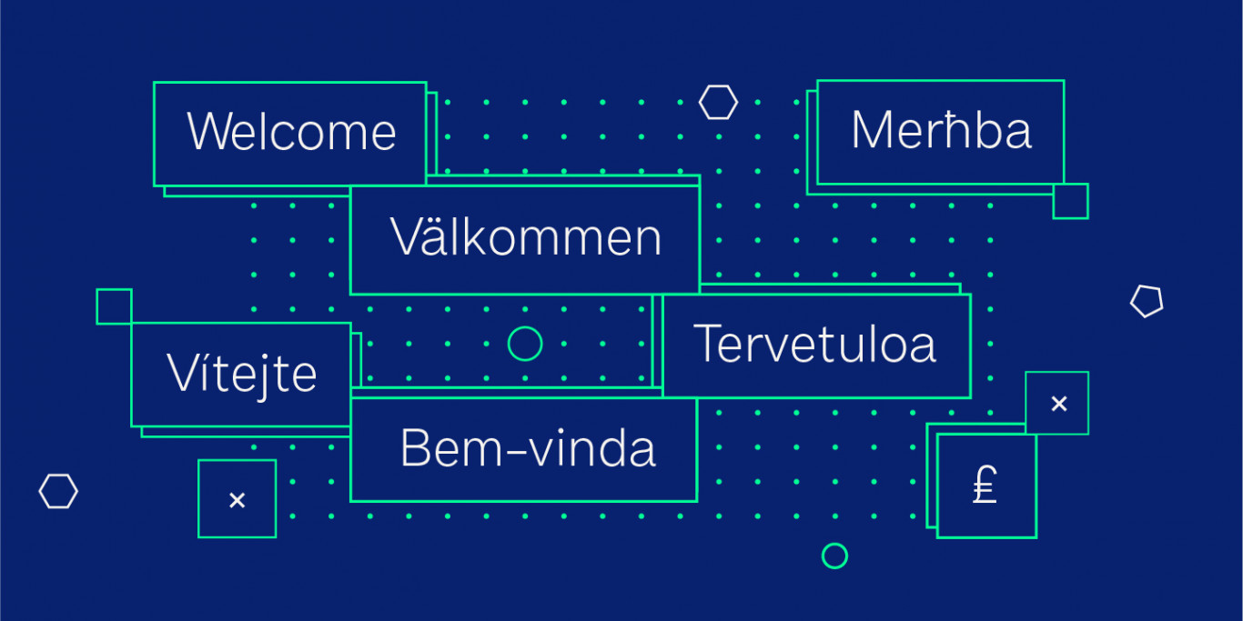
37 languages
Compita is a Neo-Grotesk(ish) typeface that started life as a love-letter to Berthold's classic. But for every rigid, Neue-Haasism, there exists an equal and opposite amount of humanist attributes – along with a deliberate dose of creative license.
Compita has some over-emphasised features and terminal endings which help to create its friendly personality, but sits them on a slightly condensed overall width – a convention normally associated with a serious and professional tone of voice. Together they help balance each other out and create a face that feels both affable and professional. Perhaps the worlds first real aff-essional typeface?
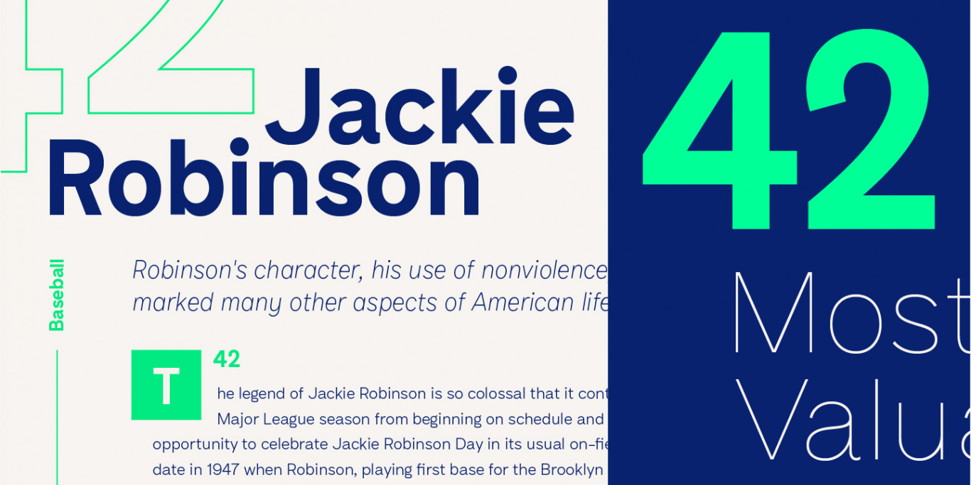
A lot of the early design work focussed on making the light weights work at scale, and as a result the weight scale is shifted more towards the lighter end. At smaller sizes the Medium or Semi-Bold weights might work better for running copy. At larger sizes the Light and Thin weights really shine, and offer a nice juxtaposition to the overly inflated bold headlines of yesteryears UI trends. Compita helps bring a more editorial and refined appeal back to digital typesetting.
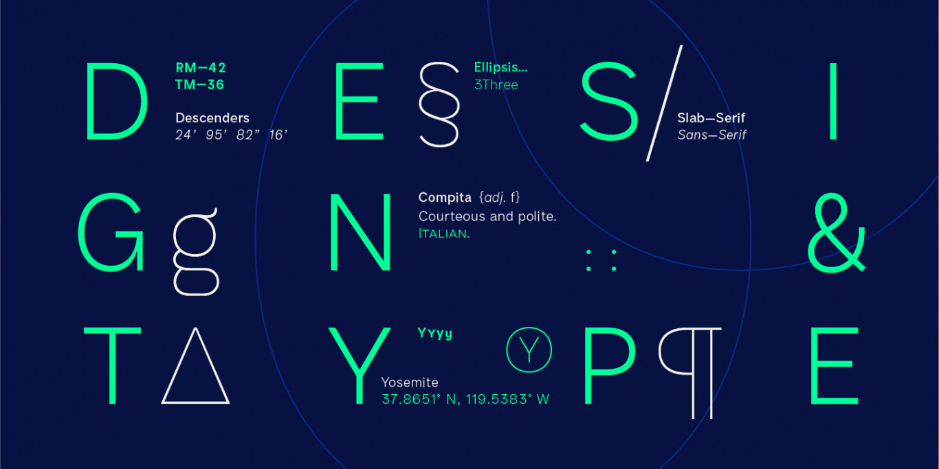
The character set contains everything the modern day designer needs, including diacritic support for over 30 languages. And It’s packed full of the usual opentype features that most will probably ignore – Small caps, multiple number sets, discretionary ligatures and of course, a few stylistic alternates. Compita also boasts a few 'extra-special' features that serve next to no purpose whatsoever, such as the roadsigns fractions. But frivolity is at our discretion, and you’re welcome.
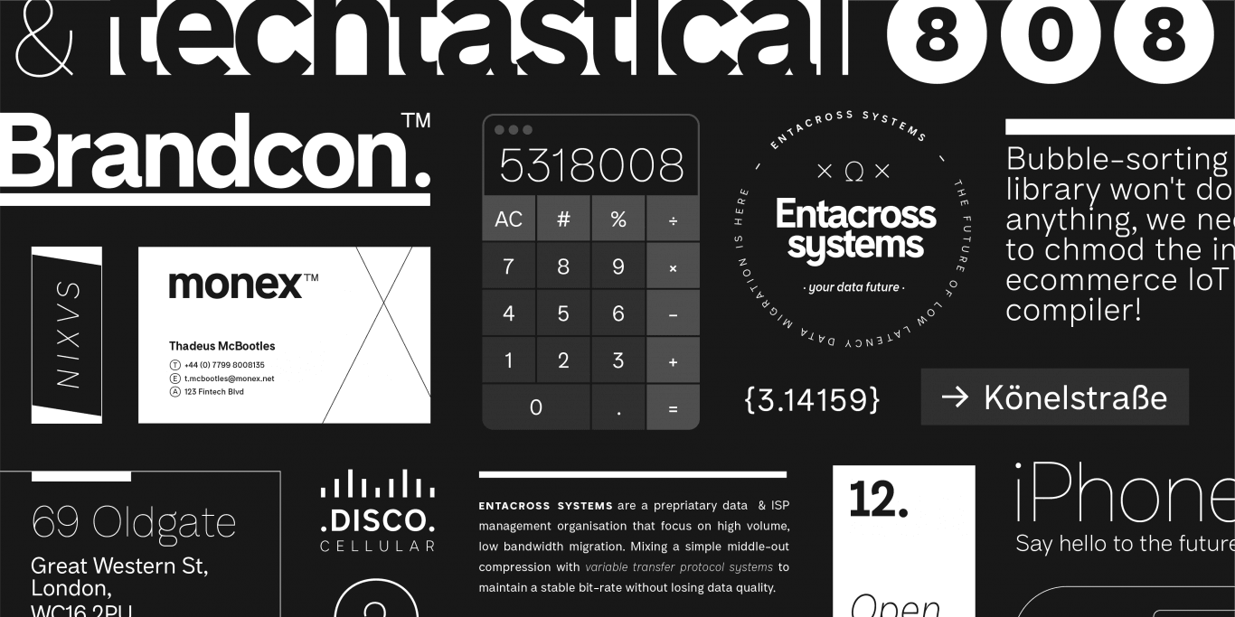
It’s cliché to say it these days but Compita really does have a wide range of potential uses, whether it’s online, or in print. It’s a perfect face for branding and visual identity design whether it’s deployed as a display face, or as the dependable choice for text. It has just enough personality to be visible, but also ignorable enough to mean you can stop using Montserrat and Raleway.