Superlumina
Variable, Unicase Sans-Serif
2021
Jonny Gibson
9 weights + Italics
v1.0
13 languages
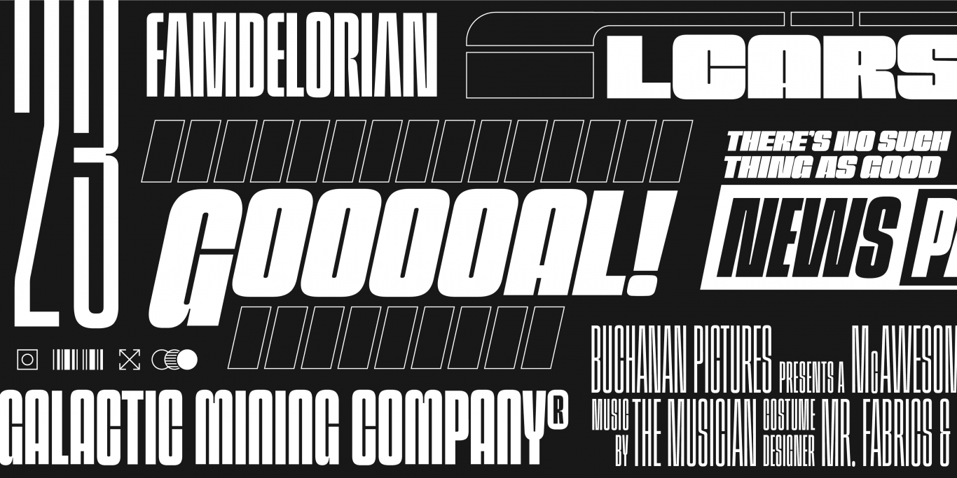
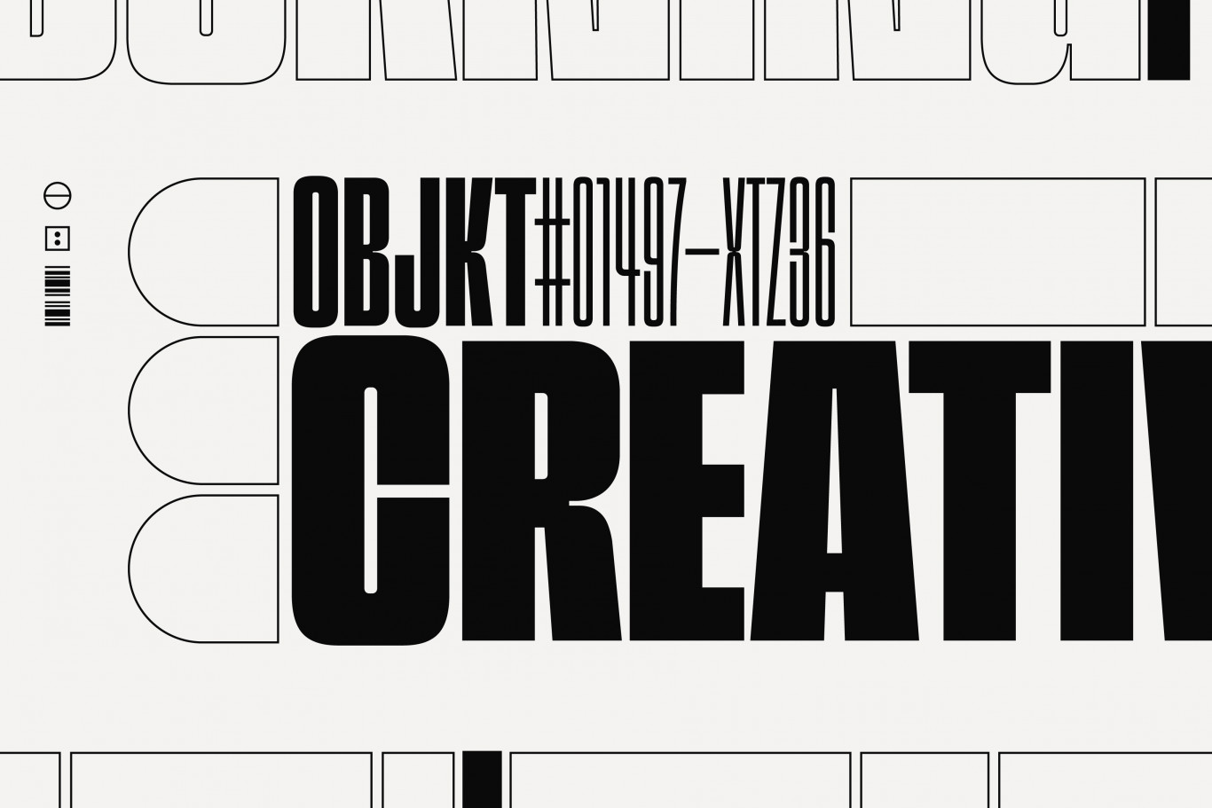
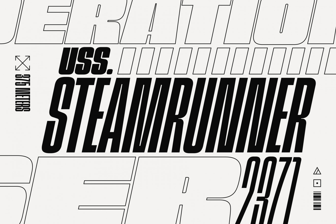
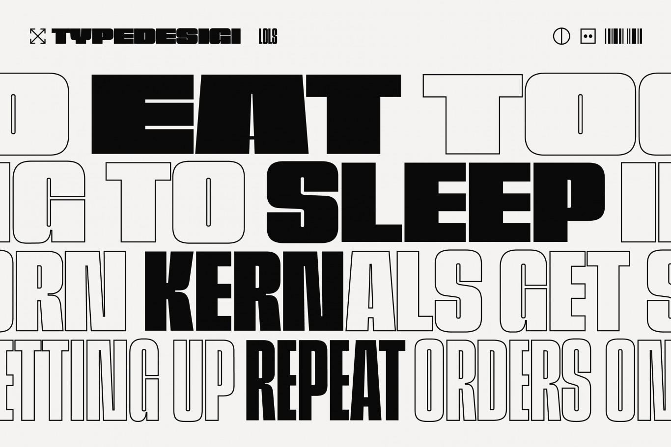
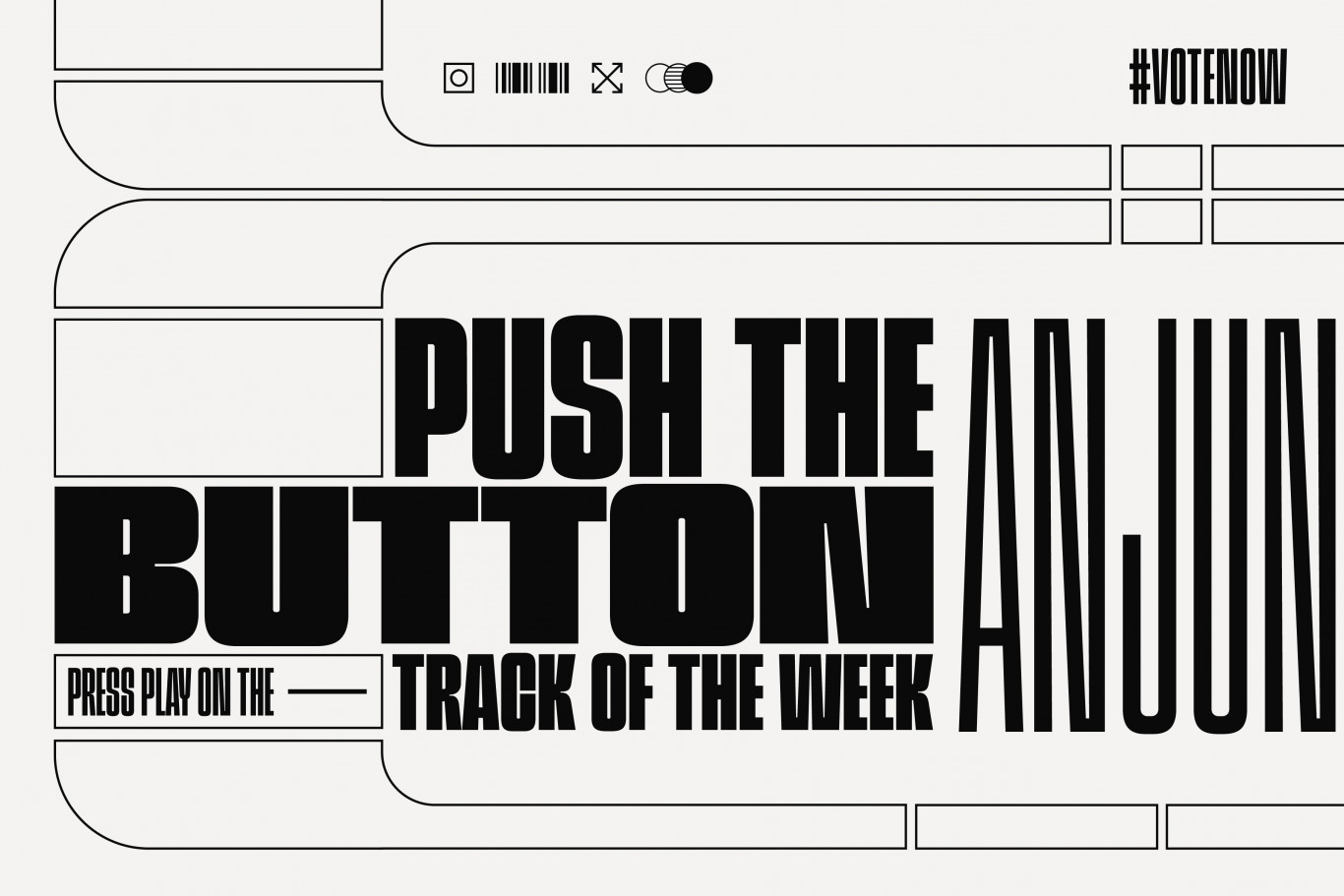
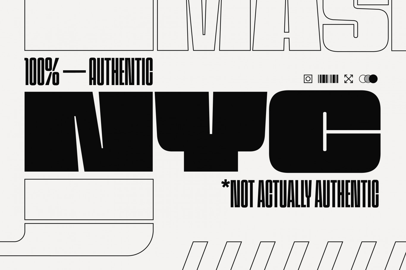
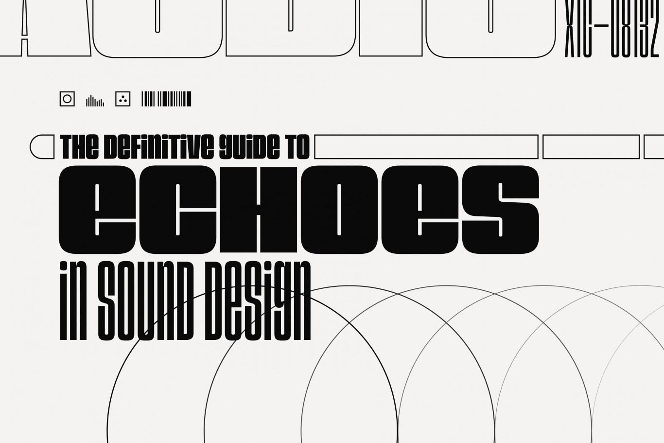
Superlumina started life as an experiment into variable fonts and multi-axes design spaces. Specifically, it is the outcome of investigation into what happens to the relationship between weight and width when counter sizes and letter spacing remains consistent. The design is evocative of old headline and poster gothics, and is built around a fairly uniform shape that helps aid the consistent spacing. The challenge of what to do with all that density while trying to maintain spacial consistency was a fun one, and results in a modern feeling take on a relatively old style. Some decisions are questionable, but the resulting texture is largely ok.
While it was never intended to be released, the final forms, and surprisingly filled out character set seemed better off out in the world, than gathering digital dust in cloud storage somewhere. So here it is – partially finished, only partially considered and therefore most likely to be only partially useful.
Whether you’re designing for sci-fi or street-wear, working on your next EDM release or just looking for a new face for setting movie poster credits… Superlumina offers some personality in an otherwise fairly uniform type classification. Its unicase set of miniscules help soften the feel a little further, where a fully fledged set of lowercase letters may otherwise break the rhythm of the designs density. The result is an interesting texture of lowercase curves and upper case corners that clearly deviates from fully set capitals in the case of most words.